1. Stillwater 16-4610
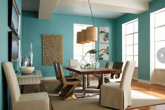
This is a soft blue colour, and is used in a lot of modern homes. It brings a beautiful beach theme to any house, and looks fantastic with oak timber floors and white skirting boards. This colour looks truely amazing and would suit any home.
This is a soft blue colour, and is used in a lot of modern homes. It brings a beautiful beach theme to any house, and looks fantastic with oak timber floors and white skirting boards. This colour looks truely amazing and would suit any home.
2.Delicacy 11-2409
This is an amazing colour, it is cream, but it has the slightest hint of red that makes it more uplifting and on a wall looks relaxing and you can use any coloured furniture because it matches the cream colour. "There's something in the color blue that triggers a relaxation response. It
makes me feel as if I'm floating in a boat, looking up at the sky. Everything
about it speaks of a gentle, tranquil, Zen state of mind. This is not an aloof
blue. It's a blue that gathers you in." —Leatrice Eiseman. Paint by Pantone.
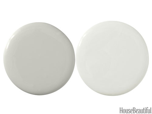
3. Sensible Hue SW6198 and Aloof Gray SW6197
These grays are just the most amazing in the world. They are incredibly soothing, and the green tinge to them means that they go with everything and will add and amazing touch to any room in your house. There's a softness to this cream, with a touch of red, that attracts me. That
bit of warmth makes it more uplifting. It's like a blossom in spring. I would do
it in a bedroom with olive, navy, or eggplant. It's gentle and clean and
optimistic — a fresh way of being Zen." —Brett Beldock. Paint by Pantone.
|
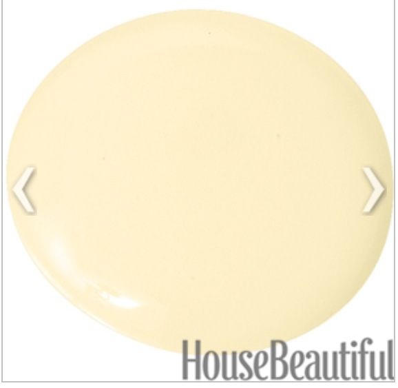
4. Shantung 11-2
This yellow will make you feel like you are getting the warmth from looking at the sun in spring, just by walking into a room. It is sure to lift any mood. "These grays are just the calmest thing in the world, and the green in them means they go with everything. I like painting a wall in two shades. The darker color grounds the room, and then the lighter runs right up to the ceiling and makes it feel higher. It creates this serene atmosphere." —Laura Bohn. Paint by Sherwin-Williams. |
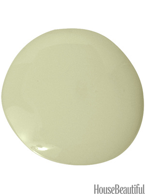
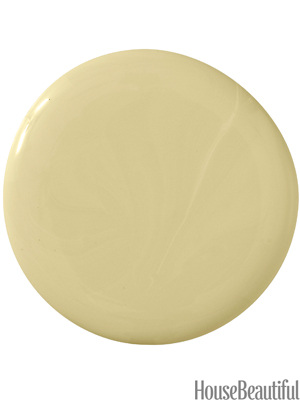
5. This colour is gorgeous. It is meant to represent nature and leaves and rebirth as it is the colour of new leaves. It works really well with cream linen and splashes of coral as well. "You know how good it feels to turn your face to the sun? That warm,
life-giving quality is one of the things that makes yellow very healing. It's a
color of hope and clear thinking. Yellow makes you feel there are possibilities.
Suddenly you see things in a new light." —Kate Smith. Paint by Pratt &
Lambert.
life-giving quality is one of the things that makes yellow very healing. It's a
color of hope and clear thinking. Yellow makes you feel there are possibilities.
Suddenly you see things in a new light." —Kate Smith. Paint by Pratt &
Lambert.

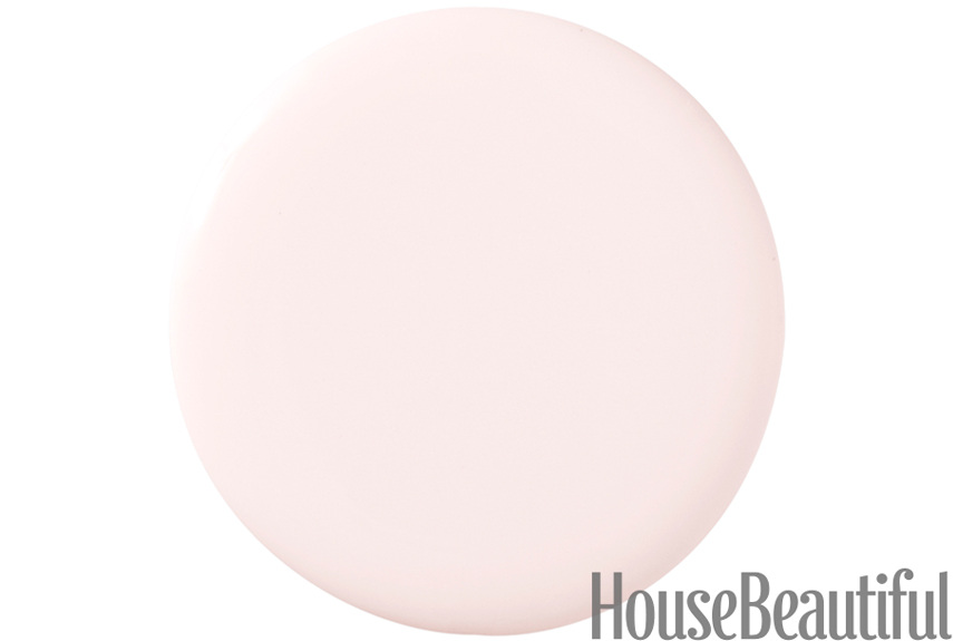
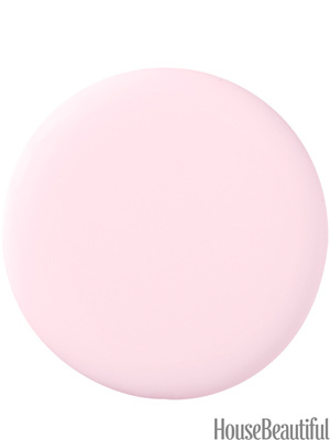
6. Fresh Pink Lemonade GLR17
"Pink represents love and tenderness. It opens up the heart and increases
receptivity. It attracts kindness and compassion, which is very helpful for
emotional healing. It will put the sweetness back into your life." —Michele
Bernhardt. Paint by Glidden.
"Pink represents love and tenderness. It opens up the heart and increases
receptivity. It attracts kindness and compassion, which is very helpful for
emotional healing. It will put the sweetness back into your life." —Michele
Bernhardt. Paint by Glidden.
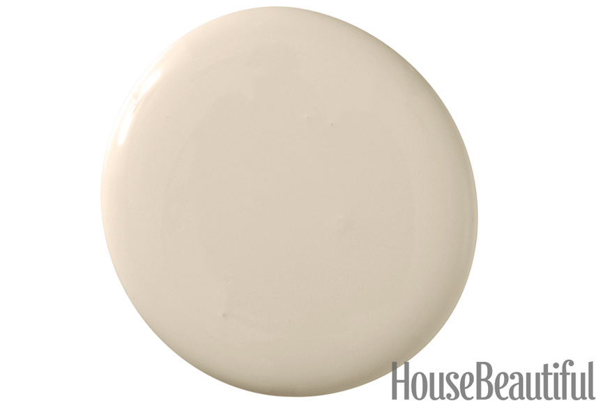
7. Stony Ground 211
"Everybody is working so hard, and you want to come home to a place where you
can rest. This beige may be neutral, but I swear it has medicinal, calming
qualities — and it doesn't require a prescription! You'll emerge refreshed, with
the energy to keep moving and creating. Bring in burnt orange, dark gray, or
indigo blue." —Erin Martin. Paint by Farrow & Ball.
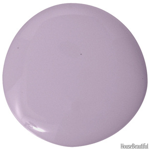
8. Inspired AF-595
"This is on a single wall in my galley kitchen. That way you don't feel like
you just fell into a berry smoothie. Violet draws out a higher consciousness, so
they say, because it's nearest to black. And it's simultaneously warm and cool,
vibrant and relaxed, vintage and fresh. It makes me a mellow kind of happy."
—Noelle Lake. Paint by Benjamin Moore.
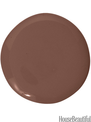
9. Etruscan Red 56
"This color envelops you, quietly penetrating like a deep massage. You can
relax and regroup, physically and emotionally, until you regain your strength.
It's the color of the clay pipes made by the indigenous people of our land to
communicate with the creator. It doesn't feel like paint. It feels like mother
earth herself." —Kathryn Scott. Paint by Farrow & Ball
DKC-63
"Green is in the middle of the spectrum, so in a sense it incorporates both
ends and embraces all the realms of light that people need for nourishment. It
evokes both warmth and coolness. Since it's ubiquitous in nature, it takes us
back to nature. Try it in a guest room or a garden room, accented with white."
—Donald Kaufman. Paint by Donald Kaufman Color.